Statement of Intent
My theme is Texture
I have chosen my portfolio to be a work of intricacy and my theme is based around "Texture". I aim to show my work by expressing myself and being creative through "capturing the moment" and giving a clear view of photography from my perspective. I would like to capture different natural textures such as the woods, leaves and vegetables and contrasted with man-made textures such as cars and clips. With my finalized images, I shall compare and annotate my best and worst of the themes as this exhibits my understanding of my knowledge in photography. In the end of this course, I will present my pre-eminent photographs in a gallery throughout the course in the home page.
The three photographers I am going to research to inspire me
For my initial research, I have a photographer in mind who I would like to explore named Edward Weston, because I am interested and astonished by his work of art. He is best known for his carefully composed, clear and sharply focused, detailed images. In my research, I am going to include the 4 C's [composition, connection, context and my comment]. My inspiration is Edward Weston and as I learn more about his photography, it gives me a chance to try out different styles and angles. He is a good inspiration as I can use his ideas in my own work as his aim was to give mundane objects a new meaning. I find this interesting as I can create and Photoshop my own pictures to look surreal. I will also look at the work of Sandra Bartocha as she has done some beautiful photography of natural texture in the landscape. I am hoping to go out on location and will use her compositional techniques to inspire my own work. Another photographer I hope to look at is Aaron Siskind as he focuses on close-up texture. A lot of his work is in black & white and this might be something I try.
Photo shoots I intend to complete
I intend to complete internal and external photoshoots such as in the studio and school trips such as Padley Gorge. I hope to start by taking photographs of fruit and vegetables, learning how to light them to bring out the texture. I will then go on location to Padley Gorge where I will be able to take photos using the natural light and learn how to change the settings on the camera. In contrast I hope to take images of man-made textures both in school and around my own environment. I also intend to discover different contrasts, saturation, white balance, exposures and brightness on settings. For further progress in developing my skills, I will be learning to edit my photos on the app Photoshop/Photopea. I will learn to photoshop from Youtube tutorials and learn about the different filters and tools. As my own independent work, I intend to visit Manchester Art Gallery and take and edit images at home. I will also take portrait pictures for my own effort.
How I will experiment and the equipment I will use
I will be developing my creativity in using a variety of equipment and tools to take photos such as my phone [Samsung Galaxy J6] also Samsung Galaxy A12 and the school Canon DSLR camera. I will experiment with different lenses and learn to take clear images by focusing on the exposure to make sure that it is not blurry. I will try different white balances, shutter speeds and aperture settings to develop my knowledge and understanding on using a camera on manual settings. . Also, I am going to be experimenting by looking at compositional techniques and learning about colours that clash in photography and complimentary colours.
How I will show progression
To show my progression, I will seek advice from my peers on creating an outstanding portfolio and listening to my teacher and completing my EBI's. Firstly, we will be learning to set up and use a camera and will be taking images of fruit & veg, products, landscapes and plants and zoomed photos in order to flaunt the beautiful details. In addition, editing and annotating my Photoshop, learning how to use different editing tools and layers by watching tutorials. I will then make formal layouts and clear explanations on my Photoshop tutorials, reflecting as i go along. At the end of the project I will put together a final gallery of my best images that will show a clear journey from start to finish and my final ideas for the project.
What I hope to learn from this project
I hope to learn that creativity photography is the way you observe images and learn about the different views of photography. I intend to take marvelous images through this course. I am excited and looking forward to learning how to use Photoshop on my images and discovering new tools and techniques. I will listen to my teachers advice and my peers to improve my portfolio. I hope that for my final outcome, I have fantastic annotations to my work and have completed all the tasks to the best of my ability.
Edward Weston Research

Context
Edward Weston was born in March the 24th, 1886, in Highland Park, Illinois. He was born into a family of intellectual substance as his father was a medical doctor and his grandfather was a professor of literature. Though, he did not find much interest in books and did not finish highschool. He recieved a camera as a gift from his father for his 16th Birthday.
As he captured his life, ad finished studying at Illinois College of photography. In 1911, he moved to California. By his mid 30s, he had good photography skills but an unexceptional portrait photographer working in Los Angeles suburb of Glendale.
He was a very active and successful participant in the photographic salons, network of self-sanctioning clubs that awarded ribbons and medals. His work throught he early 1920s became progressively better and his work theme through the pictorialist style, manipulating images in darkroom and surppressing detail.
Composition
The light is put in a direction to show the form and is subtle. This is so the light gives the picture depth. The shape of the leaf lines are formed in a triangular shape. The brightness is not too dark or white and just in the middle so you can see the details. The focused colours are all in greyscale from the human eye. The photographer has set the white balance and ISO manually on film as this image was taken in 1950s and they did not have digital cameras. Although, the rule of 3rd is not symmetrical however the shape of the cabbage leaf does give an illusion of symmetry. In my opinion, the imagery draws your eyes to the big stem as there is the most light and brightness. In the depiction, I think the shutterbug may have used the infinity curve technique as I cannot view any areas of lines or different background/colour. The photograph is landscape and I think the plain dark black background is perfect as it draws your eyes to the cabbage as it is bright and the detail is clear. This is not a portrait as there is no people and focuses on the cabbage and the editing of the cabbage as it is greyscale colours. This really links to Aaron Siskinds style of work as it is in black and white and you can see the cabbage veins detail.
Connection/Comment
This presentation is pretty simple but intricate. I admire the artists technique of tight cropping and the way that Edward has placed the cabbage a specific way to let the leaves flare and the edges feel like they are gently places on the table. The cabbage being in greyscale and the background dark gives a gloomy, shriveled look and gives an illusion as it does not look exactly like a cabbage at first but more like a net. However, one thing about this image which I don't like is there are no shadows reflecting onto the bottom base which I think makes the cabbage look bland.
Sandra Bartocha Research
Context
Sandra Bartocha (1980) is a German freelance photographer and author specialising in natural landscapes, forests and plants as well as abstract work, with the specific aim of creating images that evoke an emotional response. The beauty of nature and natural light is a great source of inspiration to Sandra. She tries to photograph nature in an artistic way rather than trying to document it, focusing on details, light, colours and moods and using creative camera techniques to capture the beauty of a scene in the best way. Sandra is vice president of the Society of German Nature Photographers (GDT) and is chief editor of the magazine GDT Forum Naturfotografie. Her pictures have been published in European magazines, several coffee table and how-to books, as well as calendars. She travelled all over Europe to show her audiovisual presentations Rhythm of Nature & LYS and has presented her more artistic work in numerous exhibitions. Her images have received prizes in numerous international competitions – including the International Photography Awards, European Wildlife Photographer of the Year, Asferico, Biophoto and the Wildlife Photographer of the Year competition in 2010, 2011, 2012, 2014, and 2016.She was one of the photographic team on the pan-European Wild Wonders of Europe initiative and has been working on a long-term project about the north of Europe – LYS. As a result she produced a 45min audiovisual show as well as a large coffee table book LYS – An Intimate Journey to the North. Recent projects include regional work in northern Germany as well as a new long-term project about tree species.
I found this information from- "https://www.oceancapture.com/team/view/sandra-bartocha"
I found this information from- "https://www.oceancapture.com/team/view/sandra-bartocha"
Composition
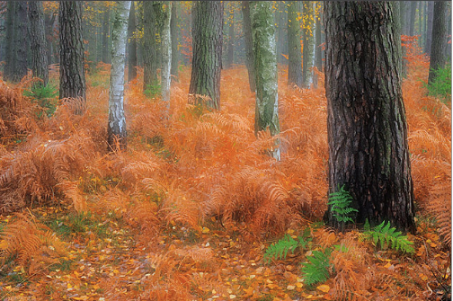
In my opinion, the main elements of the photograph is the main colours are green, orange and grey. From a far distance, you can see splashes of neon, vibrant green. The green ferns contrasts the red. It makes the green stand out as red is complimentary to green. The orange ferns look unclear/blurred and look light and the photographer gives it a soft feel. The background is a dusty grey which gives depth to the picture. I think 2 thirds of the rule of 3rd is used in this image. I think the photographer has used composition. The leaves are detailed and the darker trees stand out. The other trees are paler than others. In the distance, I can see a few blurred trees and others are darker and the details make them stand out than others. The foreground is the trees and the green ferns which my eyes are directed to. The vanishing point is the orange to green trees. The strong ventricle trunk adds interest to the shape otherwise if all trees were the same trunk shape, it would be boring and simple. The lightening is soft which makes me suggest that the image is taken in the morning or in the evening. I think that the photographer bends down on her knees to take this image in the middle on eye level. The photograph taken is landscape and located in a Western area in the woods. The season is in Autumn as you can see from the sprightly neon orange leaves on the ground. There are no people or portraits in the picture and is just nature. The image brings out a warm, smoky feel. I think this picture looks like it would be suitable for the woodlands in a fairytale.
Content
I believe Sandra Bartocha has strengths and her weaknesses as in this picture I believe it is a fairly simple but it really represents the simplicity and calmness in life. I admire her work as the neon green and orange ferns contrast perfectly and present a warm, humid, soft feel and the tranquil essence. I believe that she has done a good job in taking the picture in landscape as she can capture more than she could on portrait and I think she has used the best of her ability as you can almost feel being in the picture and the warmth of the air across your face.
Connection/Comment
This representation is fairly simple and is not a wildlife jungle. The image is Western and is not too feminine or masculine. I admire the artists portfolio and techniques in this photo used such as tight cropping and I notice that she has also used leading lines. I like the photographers work as this image link to the work that we take of the woods. I also went to a Western area and used her photo for inspiration in the Padley Gorge trip in order to capture the beauty in the rural area.
However, there is something that I don't necessarily like about the image which is that the grey background and trees which give mystical, gloomy, adventure type of atmosphere and then the ground is vibrant tangerine which gives a fairytale discovery vibe. I think this does not look complimentary and the two colours [grey and orange] clash which makes the picture look uneaven.
However, there is something that I don't necessarily like about the image which is that the grey background and trees which give mystical, gloomy, adventure type of atmosphere and then the ground is vibrant tangerine which gives a fairytale discovery vibe. I think this does not look complimentary and the two colours [grey and orange] clash which makes the picture look uneaven.
Aaron Siskind Research

Context
"Aaron Siskind was an American photographer who was born December 4th, 1903 in New York.
Aaron Siskind's early work as a social documentary photographer is best seen in his contributions to the Harlem Document (1932-40), a survey of life in Harlem. Siskind also identified with the ideas and styles of the Abstract Expressionist artists in New York in the 1940s. In these later photographs he continued to emphasize the modernist concern with the flatness of the picture plane, but intensified his approach to picture making - with close-up framing, as well as emphasis on texture, line, and visual rhymes - creating abstract images of the real world.
Accomplishments:
- Siskind turned the medium of photography on its head, taking pictures of found objects that were simultaneously true-to-life and abstract; he was one of the first photographers to combine what was known as "straight" photography (recording the real world as the lens "sees" it) with abstraction.
- Siskind found emotional joy and tension in the process of discovering subjects and photographing them in such a way as to emphasize his reading of the world as essentially abstract, a series of echoing forms, lines, and textures.
- Like the Abstract Expressionists, with whom he was friends, Siskind turned away from the social/political world post-World War II, and instead looked inward to seek meaning in the mostly inanimate forms he observed around him.
- In the early 1940s, while on a visit to Martha's Vineyard, Siskind began photographing at close range everyday objects that interested him or that seemed to reflect his emotional state at the time - things like ropes, seaweed, and footprints in the sand. Metal Hook is one of Siskind's first photographs that truly focuses on the abstract visual language of ordinary objects. The curvilinear echoes between the hook and its rope, the highly detailed textures of the ground and rusty metal, as well as the overall emphasis on form achieved through the close cropping of the frame, conspire to produce an image that abstracts reality. The flatness of the image as a whole also serves to assert the graphic quality of the metal hook itself as a sign/symbol for male and female, thus suggesting a level of content in addition to that of form.
- He died February 8, 1991 in Providence, Rhode Island.
Composition
In my opinion, the main elements in this image is the 3D water droplets and looks like zoomed in grass but the colour changed to greyscale. It looks like an action image. The grass is lighter at the front but the grass in the back is duller which gives the image tone and depth. The fact that the grass is in different positions and looks messy adds interest as if the grass was straight then it would be simply boring and would look less realistic. The brightness is not too dark or light as the image is clearly visible and able to see the intricate lines of grass. I think that the photographer has taken this picture on a field and bent their knees down to capture the grass and it may have rained on the day from the water droplets or the stylist may have sprayed water to create the effect of the wet grass.
Connection/Comment
I am interested in this style of work as it is not symmetrical and is very unique. I like the fine intricate lines on the grass in which a person could draw this image. The zoomed, detailed images of Aaron Siskinds work are linked to my work as I present zoomed detailed pictures in my work and expose the fine lines of the veins of leaves. On the ther hand, I don't like how the water droplets look on the image as they create a false cartoon look as there are not many shadows or depth in the droplets and rather looks like circles sketched and the image needs more tone when editing the image.
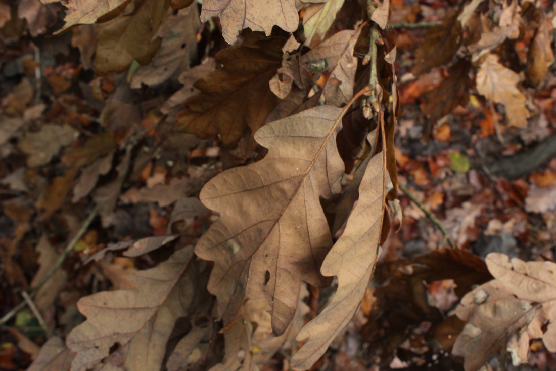
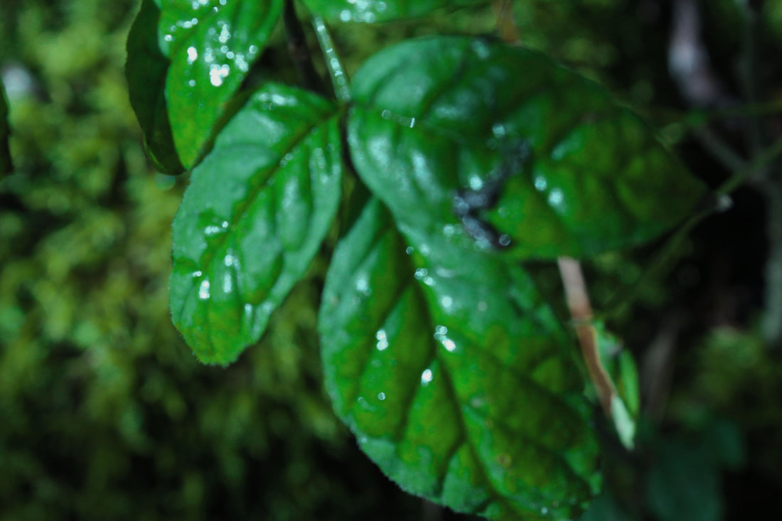
Moodboard [Natural]-Leaves


Moodboard [ManMade]-Grater


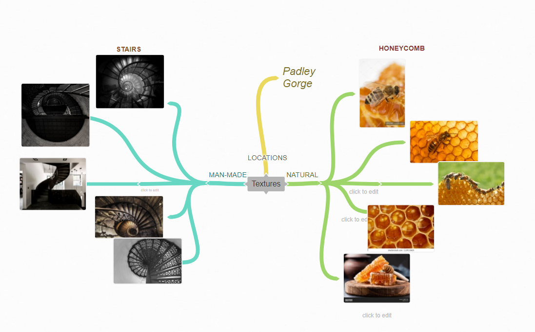
Coggle Mindmap
𝔽ℝ𝕌𝕀𝕋 𝔸ℕ𝔻 𝕍𝔼𝔾
Tomato


Best and Worst

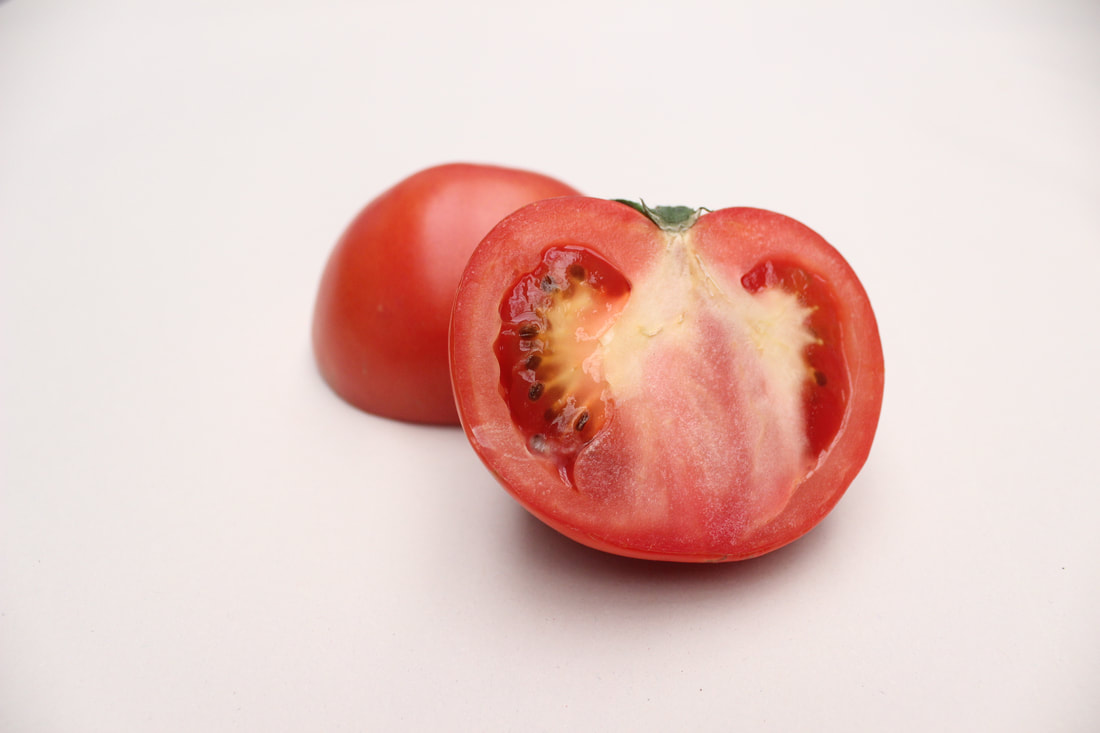
I have chosen this to be my best image because it is in focus and you can see the detail. In my opinion, the exposure is just right due to the fact the image brightness is not too dark and not too bright as you can see the intricate detail of the tomatoes inside also a clear view.
|
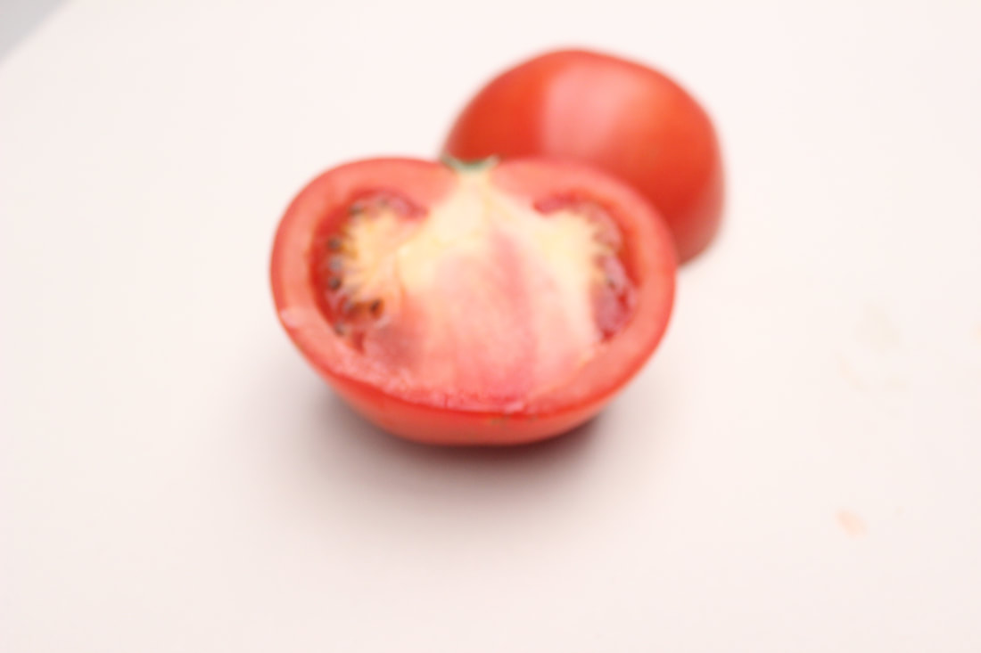
I have chosen this as my worst image as a result of blurriness and lack of view to see detail. In addition, the viewer is able to see the background as well as the photograph being taken at a far distance and neither focused.
|
Orange


Best and Worst
|
I have chosen this as my best image because you can see and almost feel the texture of the orange skin peel. It is a bright neon orange and can see the light facing towards the centre giving shadows around the sides which gives it depth.
|
I have chosen this as my worst image as the exposure is high and brightness is very light. The image does not give a realistic look due to the fact that oranges are not as pale in the picture than in real life. It does not look 3D as the shadows are not very visible.
|
Kiwi


Best and Worst

I have chosen this as my best photograph because you have a clear, zoomed picture and can see the intricate detail as I have taken better images by setting the camera to the maximum highest resolution as possible.
|

I have chosen this as my worst photograph because there is blurriness on the top front face around the outside of the seeds and I think this is quite out of full focus as I did not use a tripod to prevent the picture being blurry.
|
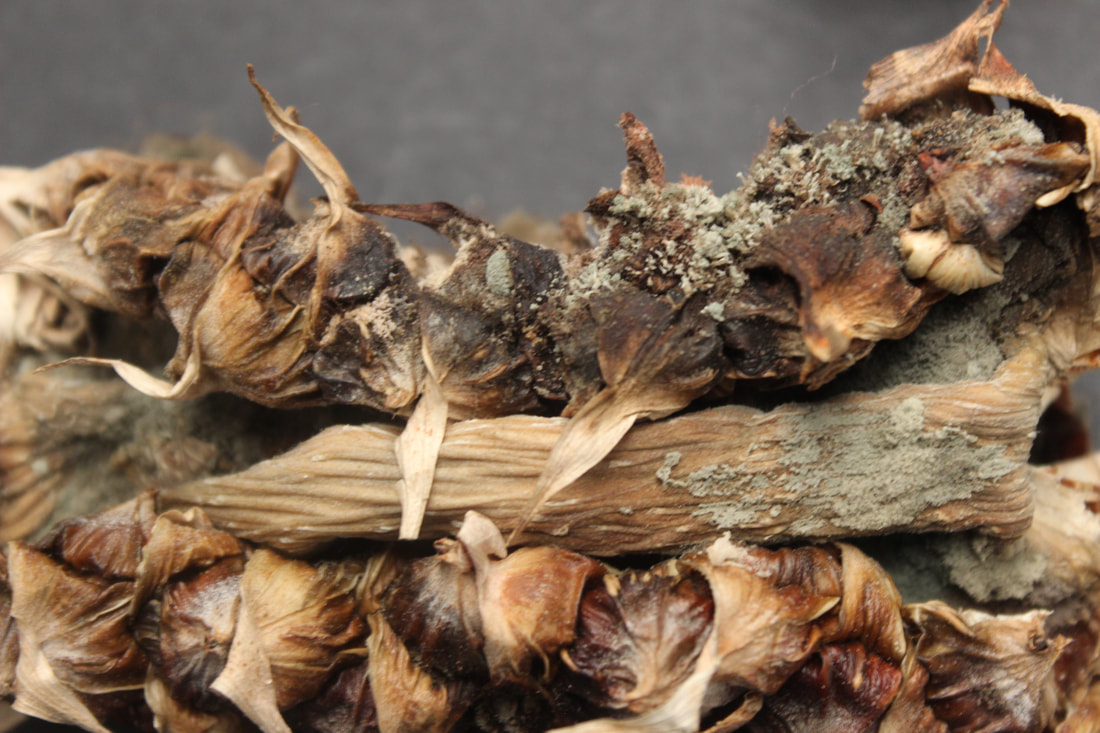
Red Cabbage


BEST and WORST


|
I have chosen this as my best picture because you can see different shapes and sizes of the lines. There is no disturbing in the background and you can see where the light is centred around.
|
This is my worst picture because the camera is unfocused. It is not blurry and you cannot see the proper detail of the veins.
|
Developing my ideas through Photoshop
Before


After

I have developed my ideas through experimenting with changing the image to black and white along with adjusting certain areas for more tone and depth. This links to my idea of exposing the nature of the intricate patterns.
Dried Pineapples


Best and Worst

This is my best picture and I am very proud of it because there is no disturbing in the background. You can see the fantastic intricate detail and it blurrs on the left which gives an effect of how I have taken the photo. It shows shadows and makes it look like the detail is shown on the side perspective.
|

This is my worst as the blurriness gives it a soft feel which does not showcase the texture and cannot see the elaborate detail of the pineapple stem.
|
Photoshop

|

|
|
This is my original image.
|
I turned the picture black and white to show the detail of the rough feel of the skin.
|
Result

Cauliflower


Best and Worst

I have chosen this as my best photo because the cauliflower looks like clouds and you can see the round lines which gives the cauliflower a soft feel as if they are clouds.
|

I have chosen this as my worst because there is a slight of blurriness in the centre, at the top.
|
Cabbage

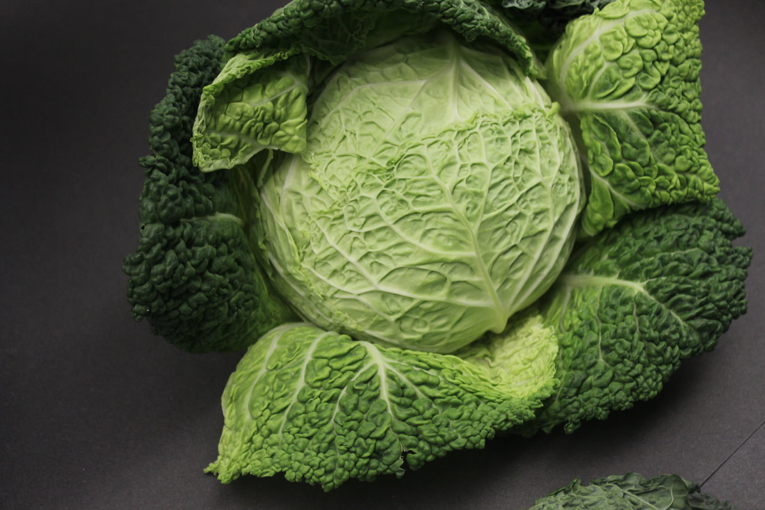


Best and Worst

I have chosen this as my best photograph because everything is in focus and you can see the beautiful, intricate detail of the cabbage and veins and looks 3D from the shadows and the contrast is great. You can alsost feel the texture of the cabbage.
|

This is my worst as the image is quite blurry which does not make the picture look very clean.
|
Sweetcorn


Best and Worst

This is my best photo because you can see the detail of the corn and the front is blurred which gives the picture a unique effect.
|

This is my worst as the brightness is very high which exposes the fact that the front corn is blurry due to the unfocused camera.
|
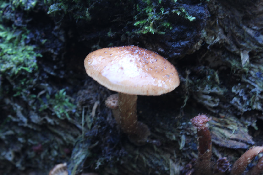
Mushroom


Best and worst
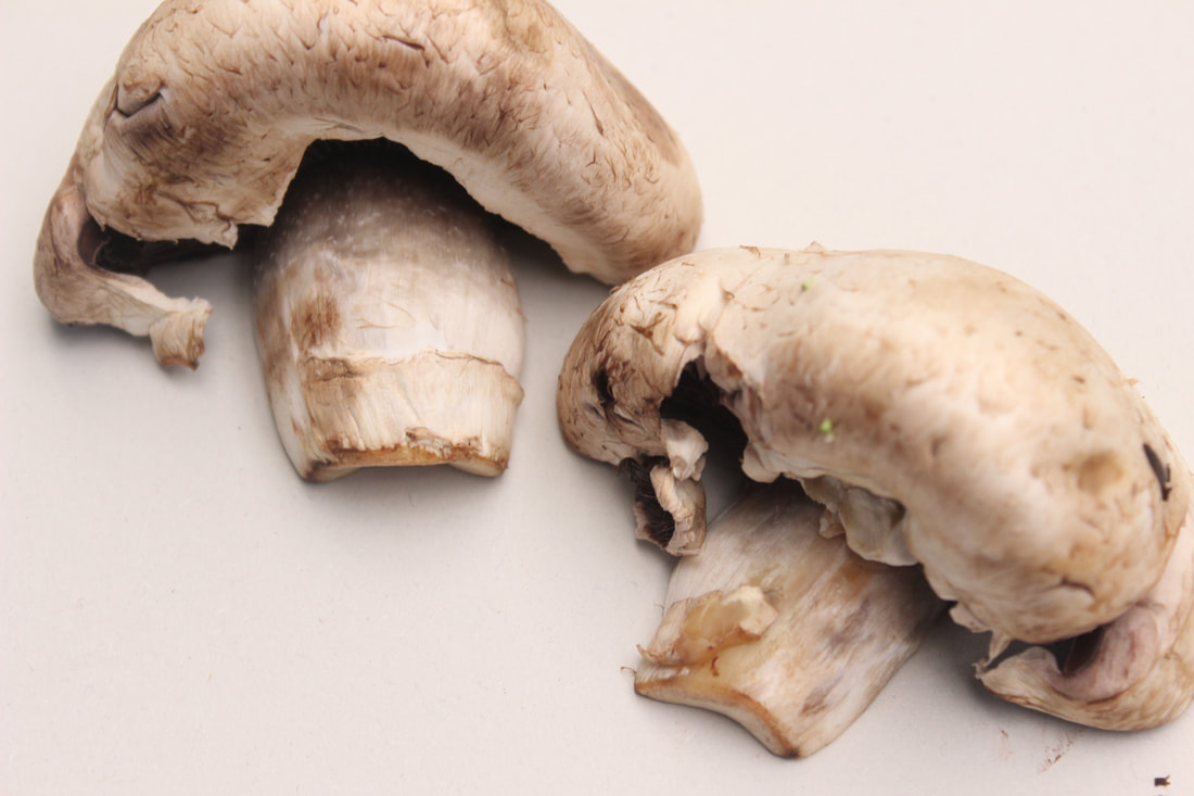
This is my best image because the mushrooms looks 3D and look very realistic in the picture and the shadows around give depth to the picture. You can see the marks and detail of the mushrooms.
|

This is my worst image because the camera lens is not right and out of focus which reveals a blurry image.
|
Pepper


Best and Worst
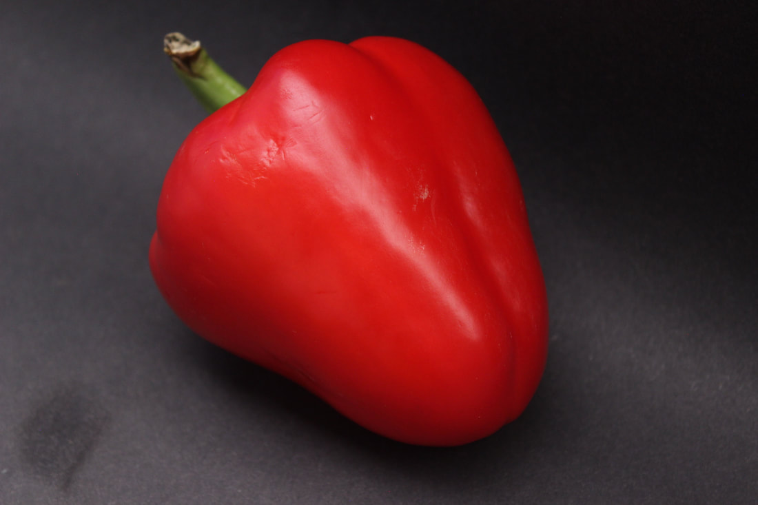
This is my best image because the shadows give depth and the pepper looks realistic and you can see the light shine on a line direction in the centre.
|

This is my worst image because if you look at the green stem, the dark area nearly camoflauges the dark background.
|
Rose


Best and Worst
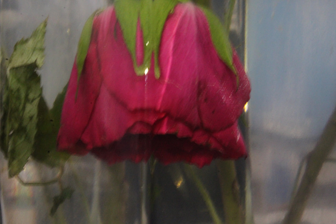
This is my best photograph because the glass makes he rose look symmetrical and the brightness is in the middle and not too light or dark.
|
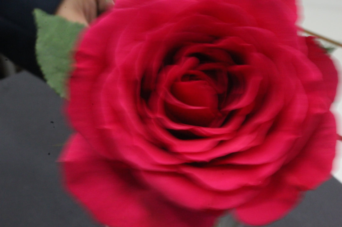
This is my worst photograph because the background is not right as there is a lot of things going around in the back and it is out of focus due to the results of blurriness and because of this the shutter speed is fast resulting to lack of detail.
|
Diamonds


Best and Worst

This is my best image as the can see the beautiful diamond duplication and the different colours on each square. It leaves a pretty colourful shadow and the black shadows 3D.
|
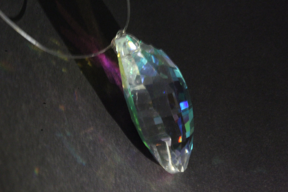
This is my worst image as you can see the string and the side is quite blurry.
|
Clips


Best and Worst

This is my best image as you can see the rust on the clip and almost give it a rough texture feel.
|

This is my worst image ass I think that the clips are far from the camera and can mostly view only the sides and you cannot see the front of the black clip. The camera could have been taken a little closer to the objects.
|
Trumpet


Best and Worst

This is my best image as I like how the camera is placed from a perspective and it is clear and the background is good as there is no out of focus disturbing.
CHESS |

This is my worst image as you can see the background and I don't think that the trumpet is very clear and looks blurry.
|


Best and Worst

This is my best image as it is bright and in order
to take the photo the camera was on the table near the chess to give an effect of what the view of chess is like. |

This is my worst image as some of the black chess camouflages into the dark background and the chess is quite far from the camera.
|
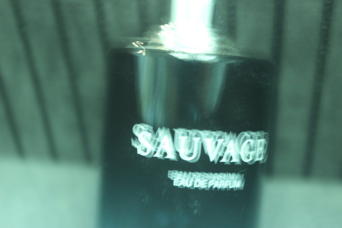
Perfume


Best and Worst

|

|
|
This is my best image as the background is dark and makes the golden perfume stand out. You can clearly see the design/pattern of the glass
|
This is my worst image as you can see the background. Also, it is only half of the perfume captured.
|


Best and Worst

|
|
|
This is my best image because you can see the perfume and the shadows giving tone.
|
This is my worst image because the picture is not clear and very blurry as you can see the writing is duplicating from the fast shutter speed.
|


Best and Worse

|
|
|
This is my best image as the light is focused on the perfume and represents the perfume like a vanilla scent as it is golden hour.
|
This is my worst image as it is an unclear, zoomed picture.
|
NATURAL
Orange Flowers


Best and Worst

This is my best photo because I like the background from the back and front and the pattern matches dark and light. You can see the intricate detail in the flower and I like the neon orange and the orange in the centre.
|

This is my worst photo because the camera is far back from the flowers and you can see the brick background which is out of context and The brightness is too bright along with the fact that my shutter speed was very fast and when I took the picture It went very fast leading to an out of focus, blurry picture.
|
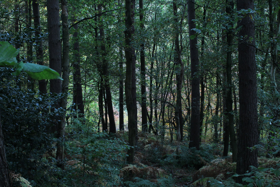
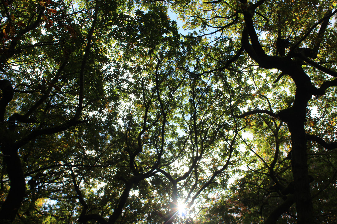
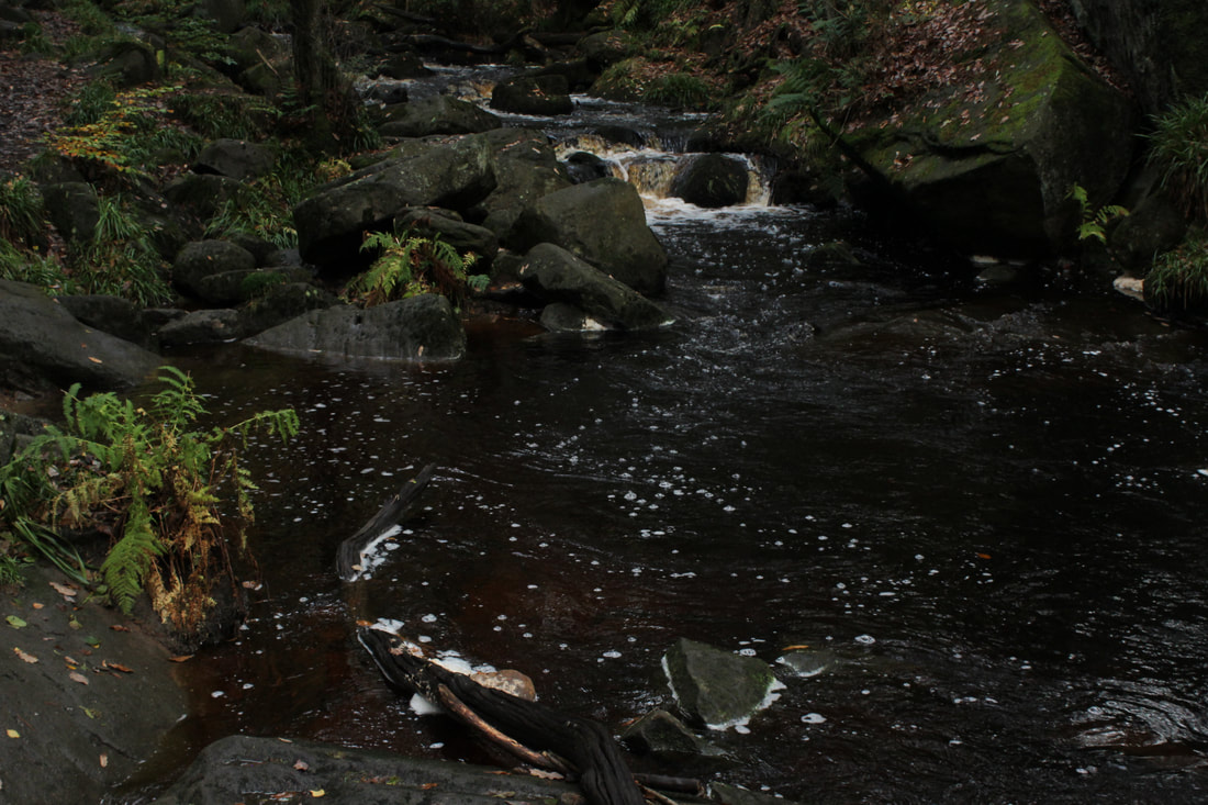
Padley George
Train Tunnel


Train Tracks


Brick Walls


Gate


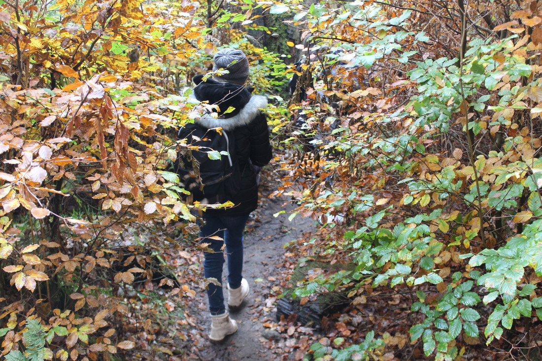
Pathways


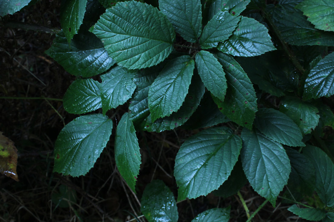
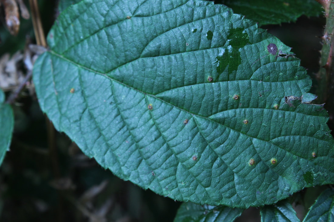
Red leaves theme


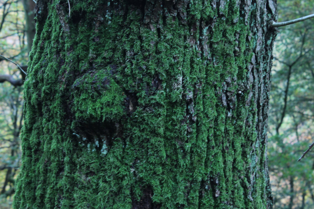
Moss

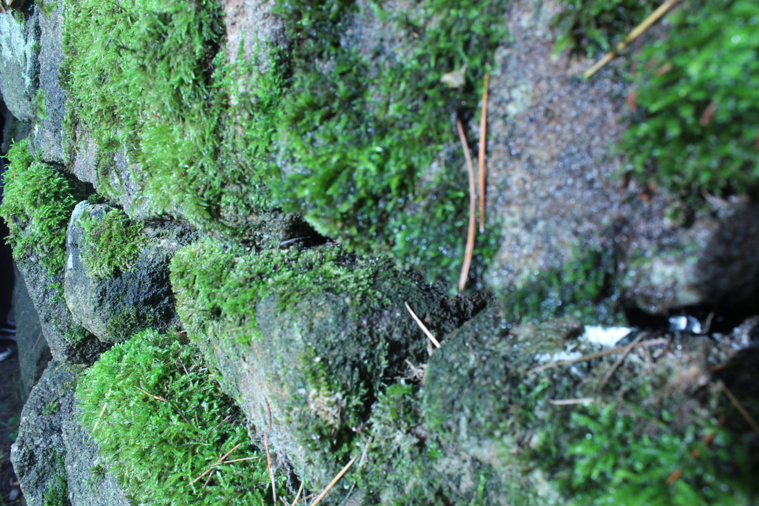


Best and Worst

This is my best image because it is clear and the burriness in the background makes the focus remain onto the rock covered in moss.
|

This is my worst as the exposure seems too low and dark and the image as a whole looks dull.
|
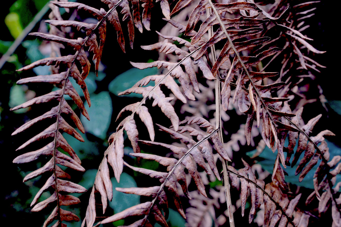
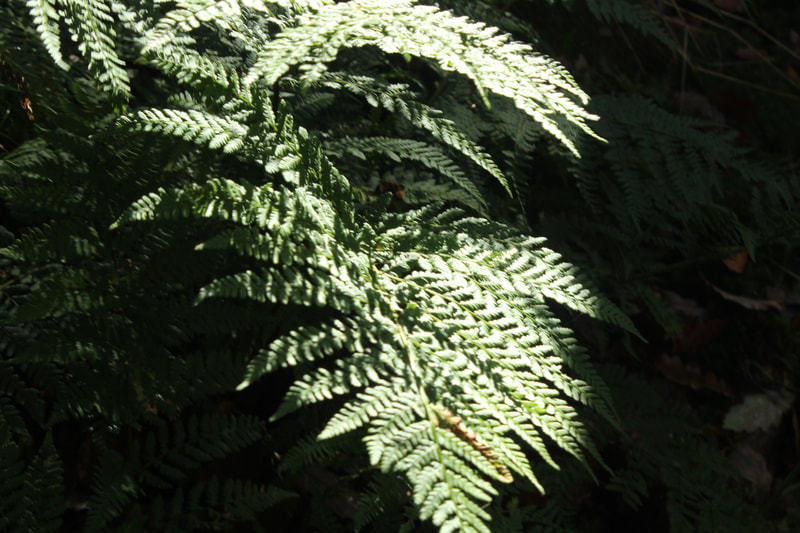
Ferns


Photoshop
Before

My intention was to add / increase the colour and fake the ferns look vibrant and stand out. |
METHOD
1. First I duplicated 2 contrast layers. 2. I change the brightness to -2 and contrast to -5 3. I add a new modify colour balance layer on purple and changed the colour settings to: 4. In the middle of Cyan and Red = +6 5. In the middle of Magenta and Green = -4 6. In the middle of Yellow and Blue = +5 7. I then add an exposure layer Exposure = 0.00 Offset = 0.0452 Gamma Correction = 1.26 After that I add the warming filter [LBA] in orange - Also add density to 25% |


After
Before
After
Flower

How to Make a Kaleidoscope in Photopea
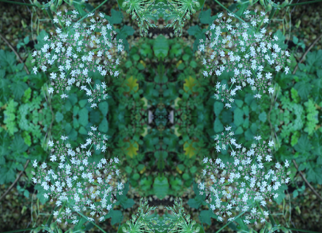
Leaves


Refining my work


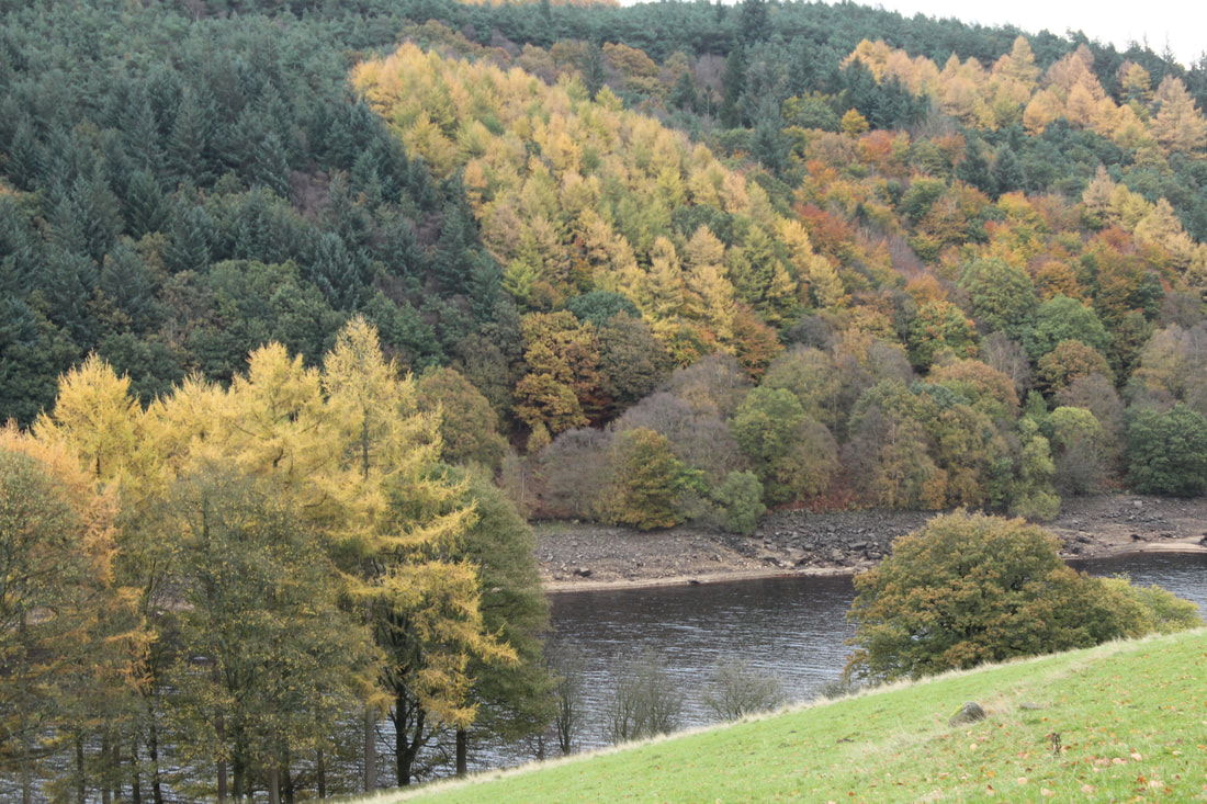
Colourful Trees


Woodlands


Tree Branches


After
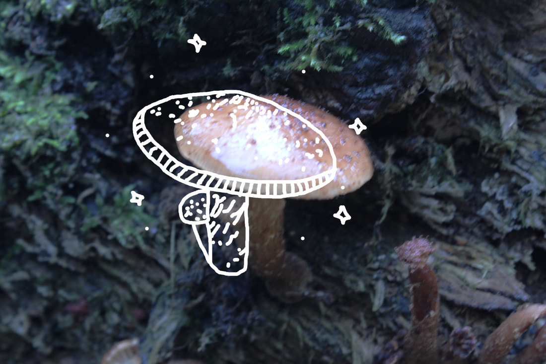
Mushroom


https://youtu.be/oScONltOqAs


Lake


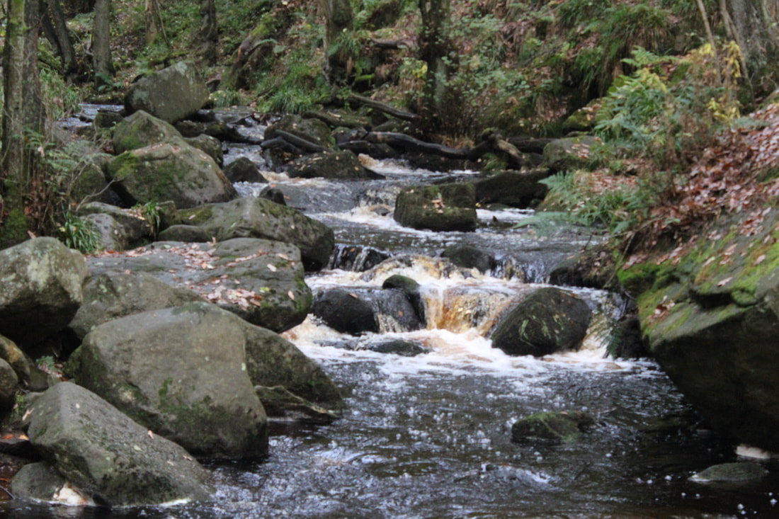
Waterfall


This is my worst image as it is too dark although this image would fit into a "Low Light" theme.
|

|
Zoomed Wood Bark


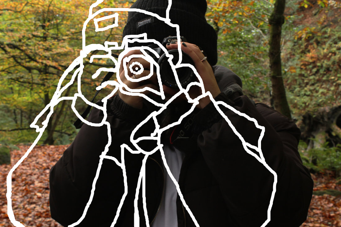
People


Refining my Ideas
Before

After

https://youtu.be/bWnRB7qovB4
Before
After
Snips from final gallery
|
|
These are a few snips from my second,third and fifth image from my final gallery to present the first few processes of editorial. Unfortunately, many of the other snips had not saved due to a problem with the database on the computers. Clearly, you can view the image is being duplicated and rotated to create a mirror reflection called "Kleidoscope".
|


Final Gallery
Kleidoscope
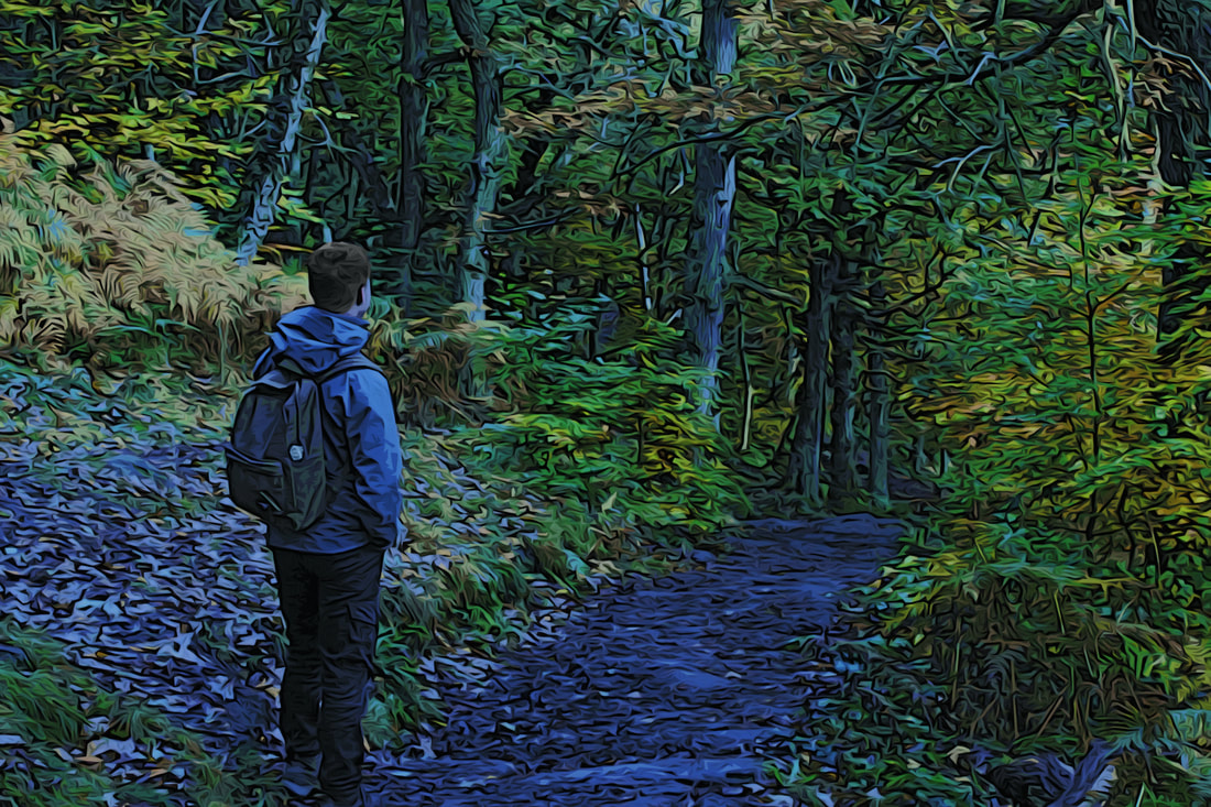
I have done Kleidoscope as part of my final ideas gallery because I imagined that it would look good with the images in which I have taken through duplicating my images. it would create an intriguing and sophisticated gallery. From using Kleidoscope, I have gained a new skill in which I have learnt from Youtube tutorials as I experimented and have never tried the kleidoscope effect and gladly this has enabled me to learn how to create the effect in reflection without missing gaps, leading to creating an amusing effect on my images and experimenting with the colour change.


Evaluation
What was the project theme and what did you think of it?
My main theme was different textures and I explored many sorts of natural forms such as leaves, veg & fruit, flowers and so on. I thought the theme was good since I was able to take images of objects that I liked such as leaves, flowers and other objects as I have the chance to play around and experiment different textural objects/equipment.
The theme allowed me to be creative as I love to zoom in on objects and expose the texture as if you can physically feel the texture by just looking at an image. Since I have been in photography, I have gained good knowledge and skills in using the camera on manual settings such as precision of whitebalance, aperture and explaining stories through pictures itself.`
The theme allowed me to be creative as I love to zoom in on objects and expose the texture as if you can physically feel the texture by just looking at an image. Since I have been in photography, I have gained good knowledge and skills in using the camera on manual settings such as precision of whitebalance, aperture and explaining stories through pictures itself.`
What part of the project did you enjoy the most/found most interesting (taking photograph? Photoshop? etc.)
In photography, I found the use of Photoshop the most interesting because I enjoyed manipulating my work and improving the images that I have taken and It helps me discover new techniques and editing tutorials.
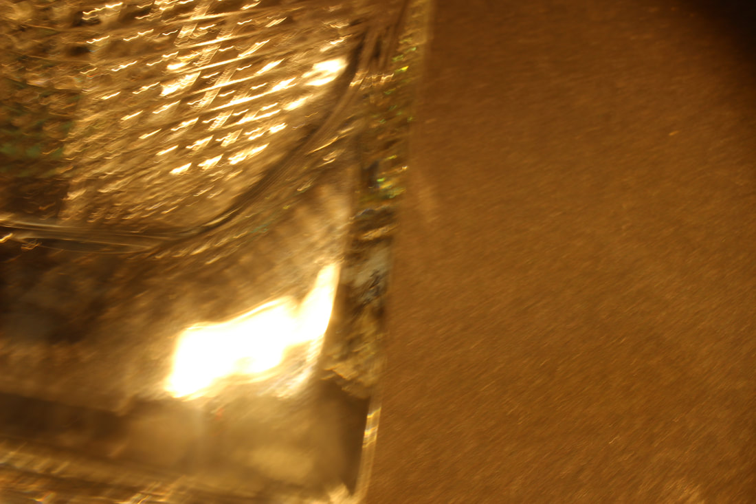
I do prefer taking photos in various locations as I have different ideas when taking portraits of people.
I enjoyed setting up location shoots in school like when I used the equipment such as a glass cube and used sand from the field to present an illusion and create a story in the viewers mind.
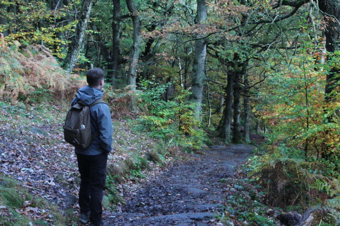
I was excited and really enjoyed taking detailed images in Padley George because I loved the nature feel and wanted to capture detailed natural objects that scream the word "LIFE" and make the person viewing the image feel of the word "Calm and Peaceful".
I found it interesting and was very engaged when learning new various skills using the camera on manual settings as I have never learnt that before.
I do prefer taking photos in various locations as I have different ideas when taking portraits of people.
I enjoyed setting up location shoots in school like when I used the equipment such as a glass cube and used sand from the field to present an illusion and create a story in the viewers mind.
I was excited and really enjoyed taking detailed images in Padley George because I loved the nature feel and wanted to capture detailed natural objects that scream the word "LIFE" and make the person viewing the image feel of the word "Calm and Peaceful".
I found it interesting and was very engaged when learning new various skills using the camera on manual settings as I have never learnt that before.
What new techniques have you experienced?
First of all, I have experienced and learnt many new photography techniques from learning about the settings on the camera to Photoshop editing. I was very ecstatic when I was building this website as I had never used Weebly before and has helped me create a more professional looking portfolio of my work.
Also, I have learnt how to use Photoshop and I am very grateful for the opportunity to use the app and express my creativity through captivating pictures. In Addition, I found it difficult at times when using Photoshop because it would not load.
Also, I have learnt how to use Photoshop and I am very grateful for the opportunity to use the app and express my creativity through captivating pictures. In Addition, I found it difficult at times when using Photoshop because it would not load.
What technique would you like to develop further?
I would like to develop my skills more in Photoshop by using more drawing tools, using kaleidoscope and collage techniques. I would like to learn ,more about how to use white balance by experimenting with outdoor shoots I feel this will help me achieve and develop my skills. I would also like to create studio set ups as this will allow me to control the lighting on my images that I capture and will give them more of a professional outcome.
Which photographers did you research through this project?
The photographers I have looked at are Edward Weston, Sandra Bartocha and Aaron Siskind.
Aaron Siskind's work I feel linked to the style of the work I wanted to create as it was detailed and was of close ups. I researched his work and I was given more inspiration and ideas that I feel can be seen in my work . I worked in the style of two of the photographers Sandra Bartocha as her work where landscape images of nature in the forest, capturing leaves, trees and other elements that I captured in Padley Gorge as it was colourful and bright just like her work.
I made my final out comes by using inspiration from the photographers however I gave it my personal touch and made it my own style by using a drawing technique which is something that they did not use in their work. Helping me achieve my final outcomes displaying personal response to the theme texture.
Which technique did you enjoy the most?
I have really enjoyed going to our first trip so far in Padley Gorge because I love outdoor locations and landscape shoots as it was similar and I was inspired by Sara Bartocha's work. This has given me various ideas and grew my confidence in exploring more about Nature and the outside work as I found it very fascinating.
What do you feel is the most successful part of your project and why?
I feel that the most successful part of my project was the outdoor Padley Gorge, Peak District shoot as I took detailed images similar to Aaron Siskind's work and further boosted my work through a drawing technique on Youtube tutorials to give a 3D effect. For my final shoot outcomes, I have used a particular technique which are drawing edits and further progressing by using them images through kaleidoscope and collage.
Did you encounter any problems in your project?
At times I found it difficult to refine my photos on Photoshop/Photopea as the server was slow and would take long to load up. Unfortunately, due to the Covid pandemic, many locations have been shut and this has stopped me from going to locations for my own independent work. However, throughout time, Covid-19 has slowly gotten better and some places are opening up again so soon I will be independently going places again.
How did you learn and how did that affect your final images?
Through photography, I have been progressing through my learning journey and have been building new skills throughout this course as I have explored Photoshop tutorials best for my project on Photoshop/Photopea and thanks to reserch, I have been more inspired to discover different photography styles and there has been times in the beginning of Photography when I forgot how to use the camera and would forget where you can change the manual settings [ blur, brightness e.t.c] but now thanks to practice, I know how to use the camera and settings.
What would you do differently given the chance to complete the project again?
I think that I would work more independently at home by organising my very own shoots outside of school and as I struggle with time management, I will set myself a deadline towards specific areas and catch up with the work. As I like indepedent shoots because I have the creativity and ideas in my head, I know and can create storytelling images through a picture and I know what is in my head and what type of images that I need to take would be especially done independently outside of school. Lastly. I would bring props to school and dedicate time on Photoshop and organising my website.
